
Diflorio Honey

Roles:
To re-design my clients logo, and develop mobile user interfaces and experiences with ui-ix.
Software:
Adobe Illustrator, Indesign, Photoshop, and Figma
Background:
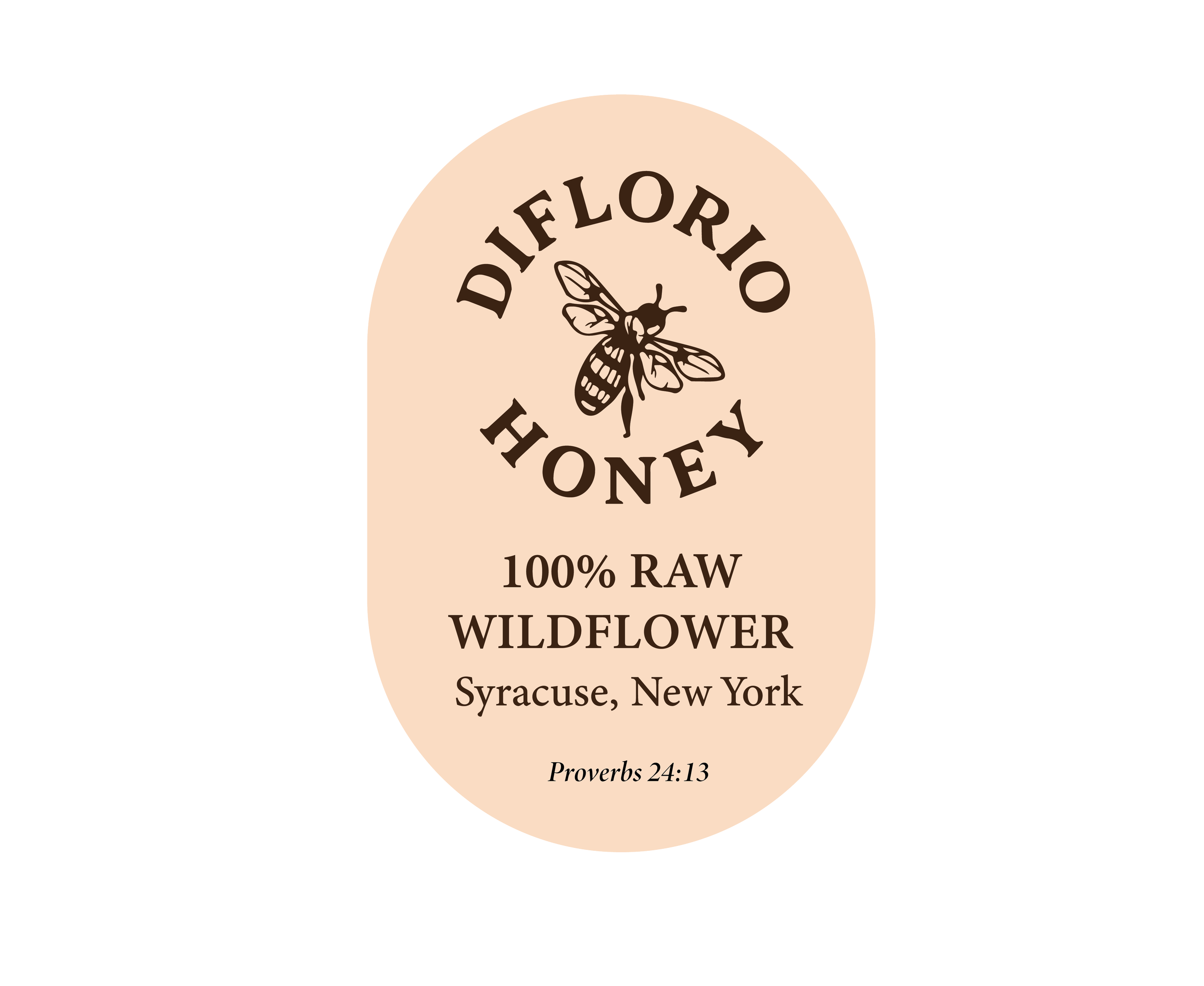
My client is a small, local business based in Syracuse that produces raw, unfiltered honey and sells it at nearby bakeries and markets. My client reached out to me to help refresh the brand by redesigning the “bland” logo and building out a more cohesive identity that better reflects the quality behind the honey.
Process:
Step 1:
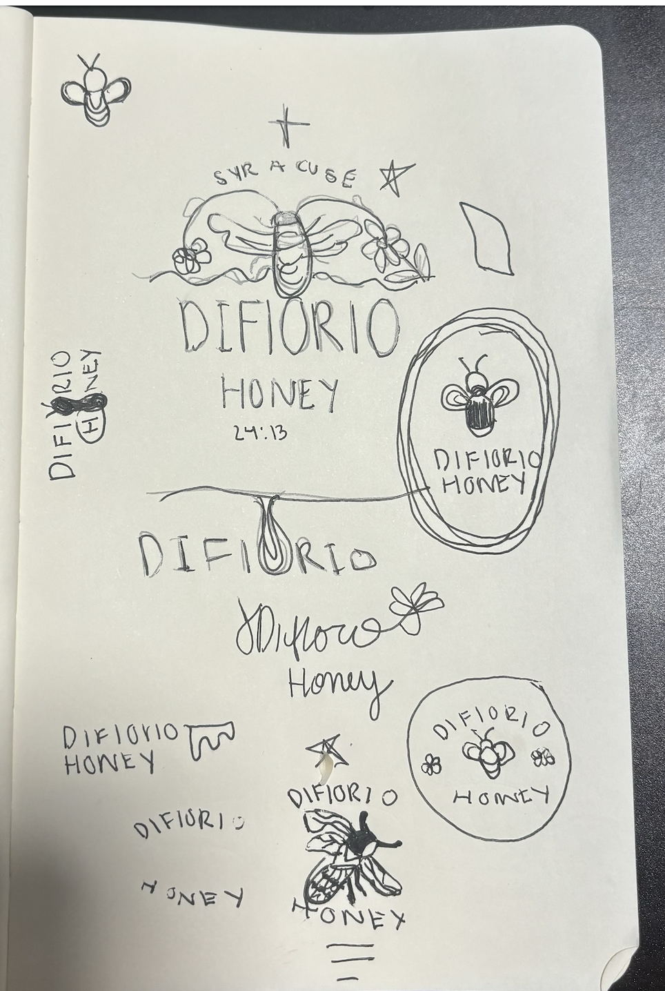
I sketched some logo ideas that were professional and still maintained the bee in the original logo. I tried to play around with the honey drips as well.
STep 2:
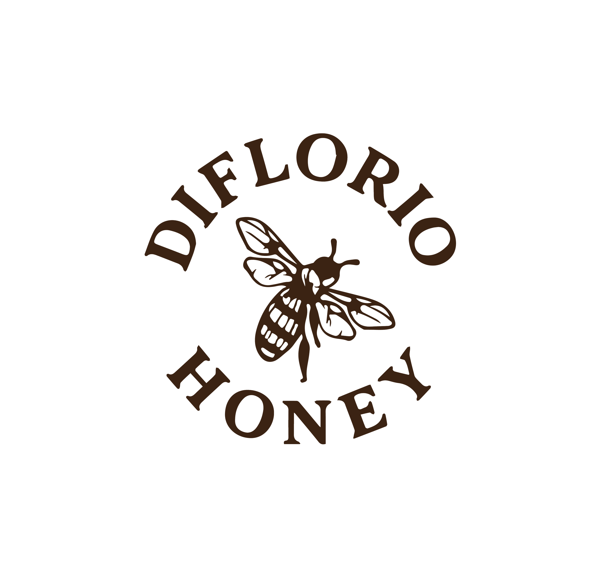
Made my logo in illustrator and played around with the kerning and type. I played with sans serifs and serifs. the client thought the sans serifs were too playful— stuck to the typeface: minion variable concept.
Step 3:
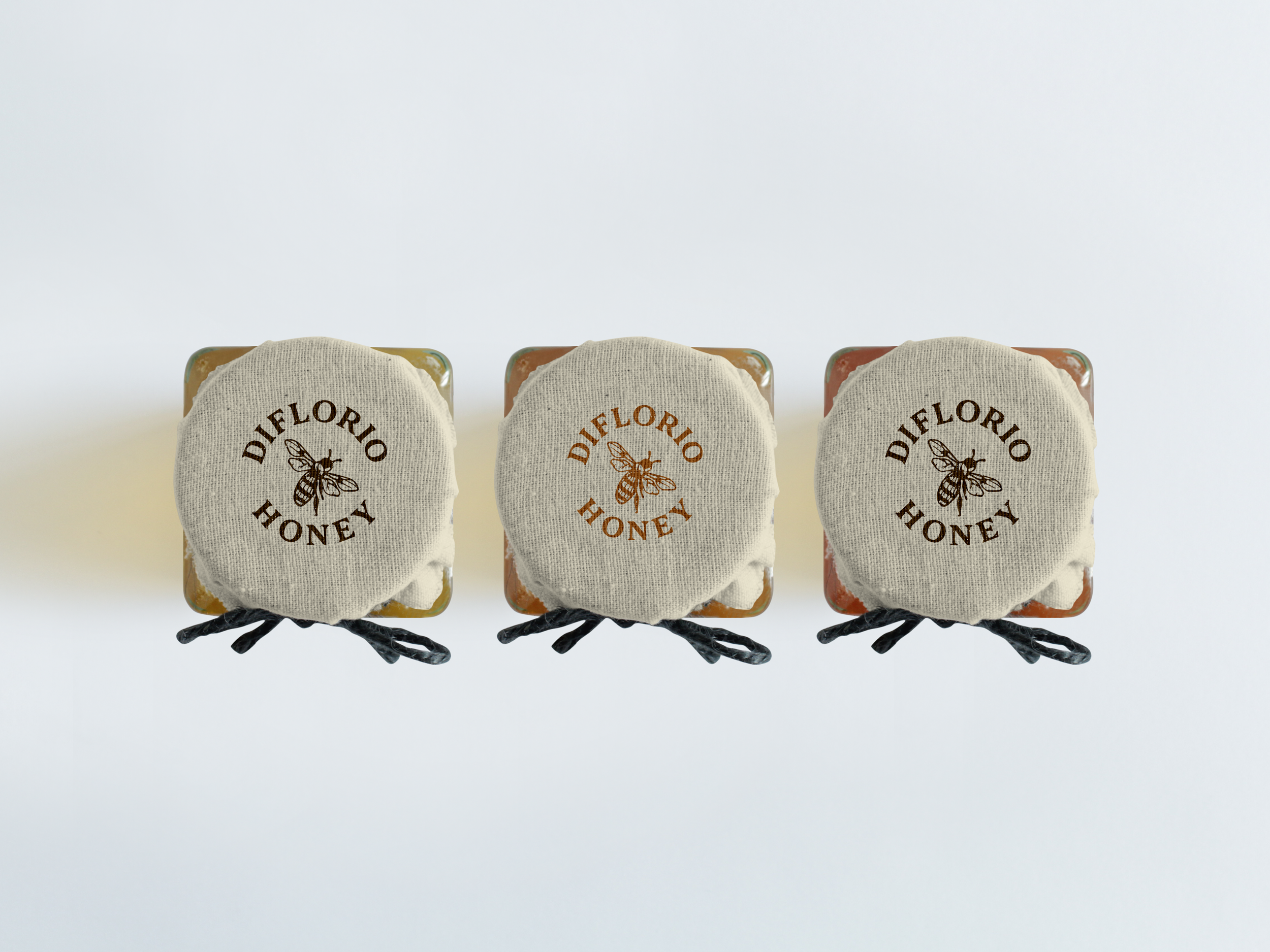
Created a background for each flavor of honey in order to differentiate them from each other and made a universal label for each flavor.


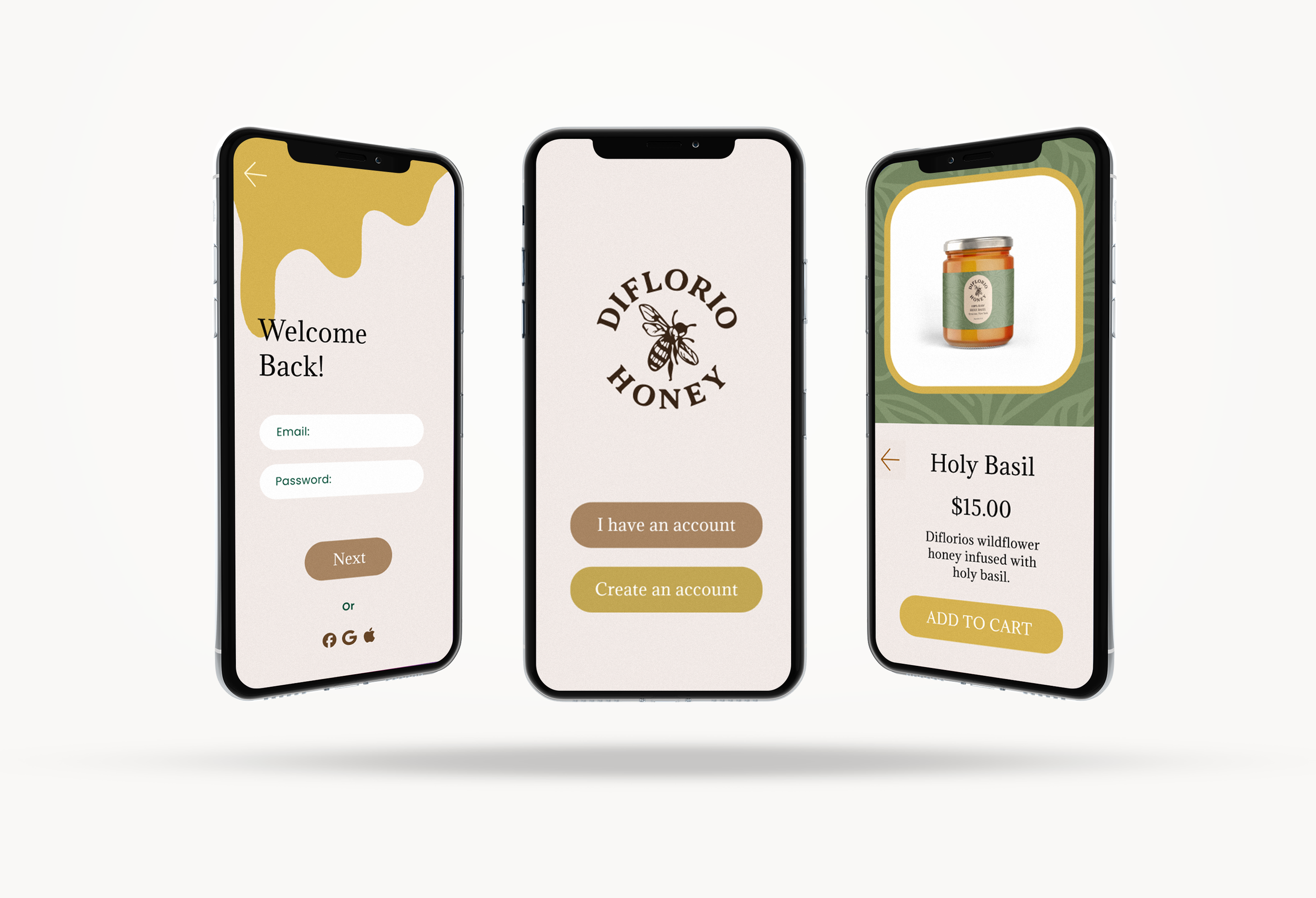

UI-UX Concept:
to maintain the professional yet colorful tone that aligns with my client’s vision — allowing the audience to perceive the honey as both high-quality and approachable within the mobile user interface.”
Process 2:
Step 1:
I created a Mobile user interface in figma that i personally loved but was too playful for the client.
Step 2:
Redo the user interface design to make a more professional and elegant feel.
step 3:
Prototype the sign up steps and main home page.


Mobile User Interface Mockup:
I Wanted to create a smoother flow compared to my first User Interface mockup. I added more movement and connected the app to the brands style rather than a playful one.